
Author: Evgeny Bodyagin, https://dsprog.pro
In this article, we will examine advertisements of cars for resale (from a broker’s perspective). Several questions arise:
- Brand and model popularity – what is the market situation?
- How can we identify specific “underestimated” advertisements?
- To what extent are they underestimated?
- What markup can a broker set for resale?
- What strategies are possible?
- Is it possible to obtain any data on the resale market volume?
There are many questions, so let’s delve into them.
It should also be noted that the approach used here is applicable not only to cars but also to real estate, equipment, and so on. The data on car sales were obtained through parsing from a foreign online platform.
For analysis, we will utilize elements of correlation analysis and Random Forest.
This article in no way claims that the volume of calculations demonstrated here is necessary and sufficient. This is the tip of the iceberg 😉
Data structure
- Make: Brand car.
- Model: Model car.
- Year: Year of car manufacture.
- Engine Fuel Type: Type of fuel that is used for the engine.
- Engine HP: Car engine power in horsepower.
- Engine Cylinders: The number of cylinders in a car engine.
- Transmission Type: Type of transmission (gearbox).
- Driven_Wheels: The vehicle’s drive type, for example, “front wheel drive”.
- Number of Doors: Number of doors on the car.
- Market Category: Category of the car on the market.
- Vehicle Size: Car size.
- Vehicle Style: Car style.
- Highway MPG: Highway fuel economy in miles per gallon.
- City MPG: City fuel economy in miles per gallon.
- Popularity: An index of a car’s popularity based on its sales or market demand.
- MSRP: Recommended retail price of the car.
Loading required packages
import sklearn
import sys

from sklearn.ensemble import RandomForestRegressor
from sklearn.model_selection import cross_val_score
from sklearn.preprocessing import LabelEncoder
import csv
import numpy as np
import pandas as pd
import plotly.express as px
import plotly.graph_objects as go
from sklearn.model_selection import train_test_split
from sklearn.metrics import classification_report
Loading data
full_data = pd.read_csv("input/data.csv")
headers = full_data.columns.tolist()
# Display the dataset headers
print(headers)
[‘Make’, ‘Model’, ‘Year’, ‘Engine Fuel Type’, ‘Engine HP’, ‘Engine Cylinders’, ‘Transmission Type’, ‘Driven_Wheels’, ‘Number of Doors’, ‘Market Category’, ‘Vehicle Size’, ‘Vehicle Style’, ‘highway MPG’, ‘city mpg’, ‘Popularity’, ‘MSRP’]
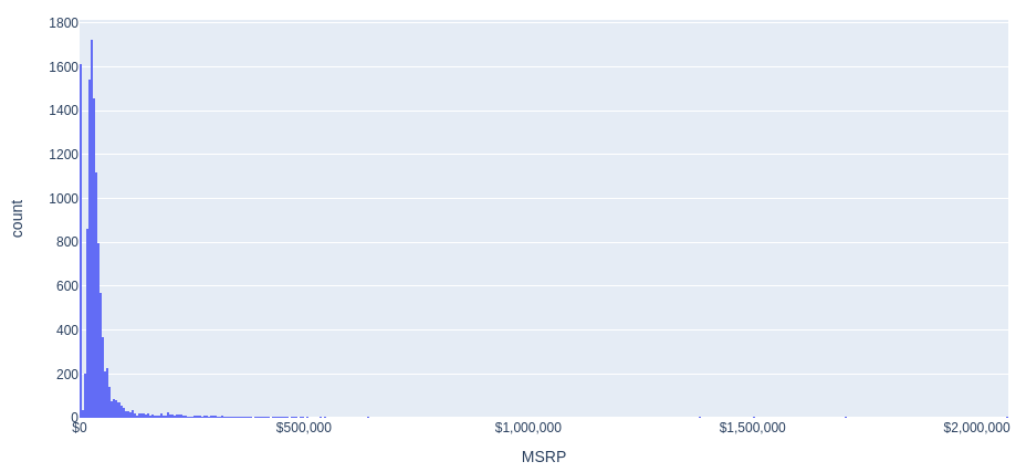
Price distribution histogram (MSRP)
Let’s build a histogram of the distribution of car prices.
fig = px.histogram(full_data, x='MSRP', nbins=500)
fig.update_layout(
    width=1000,
    height=500,
    xaxis=dict(
        tickformat='$,.0f',
        ticktext=full_data['MSRP'].map(lambda x: '${:,.0f}'.format(x))
    )
)
fig.show()
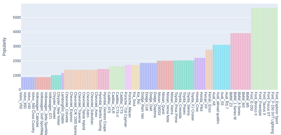
Popularity of brands and car brands
Let’s build a diagram of the popularity of Make, Model combinations.
# Let's create a separate dataset 'cars_popularity':
cars_popularity = pd.DataFrame()
cars_popularity['Make'] = full_data['Make']
cars_popularity['Model'] = full_data['Model']
cars_popularity['Popularity'] = full_data['Popularity']


# Let's combine 'Make', 'Model' into a single indicator 'Make_Model':
cars_popularity['Make_Model'] = cars_popularity['Make'] + '_' + cars_popularity['Model']
# Remove duplicates:
cars_popularity = cars_popularity.drop_duplicates(subset=['Make_Model'])

# There is too much data to display a popularity chart.
# this content is from dsprog.pro
# To highlight the most popular car types relative to the median Popularity value:
median_popularity = cars_popularity['Popularity'].median()
cars_popularity = cars_popularity[cars_popularity['Popularity'] >= median_popularity]

# Sort the DataFrame by the Popularity column:
cars_popularity = cars_popularity.sort_values(by='Popularity')

# Create a bar chart using plotly:
fig = px.bar(cars_popularity, x='Make_Model', y='Popularity', title='Popularity by Make and Model', color='Make', height=600, width=1024)
fig.update_layout(showlegend=False)
fig.show()
Elements of correlation analysis
The procedure for searching for advertisements with underestimated prices is based on indicators/characteristics. But… do we need all of them? It is desirable to operate with strong (informative) indicators. Then the Random Forest classification model will have good performance.
The informativeness can be assessed based on correlation, where the absolute value should exceed a certain threshold. Let’s set this threshold to 0.25.
If the correlation between the considered indicator is less than -0.25 or greater than +0.25, we will consider it potentially strong in the Random Forest model. However, if the correlation value falls within the range (-0.25, +0.25), we filter out/do not consider the current indicator/characteristic of the car.
Due to the diverse nature of the indicators, we will use the non-parametric Spearman’s correlation coefficient as a measure of correlation. It should be noted that this technique requires additional processing.
To avoid increasing the length of this article, we will limit ourselves to a simplified version of calculations.
# Remove broken lines in the dataset
full_data = full_data.dropna()

# Let's save the Make and Model indicators in separate dataframes, they will be useful to us later ;)
Xmake = full_data['Make']
Xmodel = full_data['Model']

# Encoding categorical variables
encoder = LabelEncoder()
categorical_columns = ['Make', 'Model', 'Engine Fuel Type', 'Transmission Type', 'Driven_Wheels',
                       'Market Category', 'Vehicle Size', 'Vehicle Style']
for col in categorical_columns:
    # this content is from dsprog.pro
    full_data[col] = encoder.fit_transform(full_data[col])

# Calculate Spearman correlation for all columns/indicators
full_corr = full_data.corr(method='spearman')

# Create a heat map of correlations
fig = go.Figure(data=go.Heatmap(
                   z=full_corr.values,
                   x=full_corr.columns,
                   y=full_corr.columns,
                   colorscale='RdBu'))
fig.update_layout(
    title='Correlation between MSRP and other variables',
    width=800,
    height=700
)

fig.show()
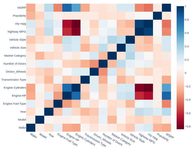
We are interested in the top row (MSRP). We are interested in correlations with saturated color. It’s time to filter out potentially weak indicators!
threshold = 0.25
columns_to_exclude = full_corr.columns[(full_corr['MSRP'] < threshold) & (full_corr['MSRP'] > -threshold)].tolist()

print("Potentially weak indicators/characteristics whose Spearman correlation is in the range of -{} to +{} with MSRP:".format(threshold, threshold))
print(columns_to_exclude)

columns_to_exclude.remove('Model')

print("Let's leave the 'Model' indicator as potentially strong.")
print("We will adjust the list taking into account this nuance.")

print("Potentially weak indicators/characteristics whose Spearman correlation is in the range of -{} to +{} with MSRP:".format(threshold, threshold))
print(columns_to_exclude)
Potentially weak indicators/characteristics whose Spearman correlation is in the range of -0.25 to +0.25 with MSRP: [‘Model’, ‘Driven_Wheels’, ‘Number of Doors’, ‘Market Category’, ‘Vehicle Size’, ‘Vehicle Style’, ‘Popularity’]
Let’s leave the ‘Model’ indicator as potentially strong. We will adjust the list taking into account this nuance.
Potentially weak indicators/characteristics whose Spearman correlation is in the range of -0.25 to +0.25 with MSRP: [‘Driven_Wheels’, ‘Number of Doors’, ‘Market Category’, ‘Vehicle Size’, ‘Vehicle Style’, ‘Popularity’]
Let’s remove potentially weak indicators.
for column in columns_to_exclude:
    full_data = full_data.drop(column, axis=1)
Preprocessing function
To divide the data sample into a dataset of explanatory and explained variables, we will write the corresponding function.
def GetDataForProcessing(full_data, Xmodel, Xmake):

    X = pd.DataFrame()
    Y = pd.DataFrame()
    #
    X = full_data.drop('MSRP', axis = 1)
    Y = full_data['MSRP']

    # One-Hot encoding transformation; NaN values should not be included in the dummy variables.
    string_columns = X.select_dtypes(include=['object']).columns.tolist()
    # this content is from dsprog.pro
    # Converting Columns to dummy variables
    X = pd.get_dummies(X, dummy_na=False, columns=string_columns)

    # That's where the text information about the brand and model comes in handy ;)
    X.insert(0, 'ModelRef', Xmodel);
    X.insert(0, 'MakeRef', Xmake);


    X.fillna(0, inplace=True);
    return (X, Y)
Loading data
Let’s get datasets of explanatory and explained variables.
(X, Y) = GetDataForProcessing(full_data, Xmodel, Xmake)
Building a predictive Random Forest model
It’s time to launch Random Forest!
# Convert dataframe Y into a one-dimensional array:
Y_unraveled = np.ravel(Y);


# Let's divide the data set into a training part and a testing part:
print('Splitting into training and testing...')
# this content is from dsprog.pro
X_train, X_test, Y_train, y_test = train_test_split(X, Y_unraveled, test_size=0.10, random_state=14)


# Remove brand and model columns from the resulting samples; this is necessary to send data to Random Forest:
X_train2 = X_train.drop('MakeRef', axis = 1).drop('ModelRef', axis = 1)
X_test2 = X_test.drop('MakeRef', axis = 1).drop('ModelRef', axis = 1)


# Let's determine the number of trees in the ensemble:
nEstimators = 500

# Start building Random Forest
# this content is from dsprog.pro
print('Start processing...')
clf = RandomForestRegressor(n_estimators=nEstimators, max_features="sqrt");

# Let's train the RandomForestRegressor model on the X_train2 and Y_train data.
clf = clf.fit(X_train2, Y_train);
print("Processing completed.")


print('Calculating error...')
# Apply the trained model to the test data to predict the target variable.
y_pred = clf.predict(X_test2);
# Let's calculate cross-validation estimates for a model with the number of parts (folds) equal to 5
scores = cross_val_score(clf,X_test2,y_test, cv = 5)

# The performance metric for scores is the coefficient of determination (R-squared).
print("Scores:")
print(scores);
print("Mean absolute error:");
mean_error = sum(abs(y_test-y_pred))/len(y_test);
print(mean_error);
print("Mean percent error: ")
print(mean_error/np.mean(y_test))
Splitting into training and testing…
Start processing…
Processing completed.
Calculating error…
Scores:
[0.86870384 0.89972474 0.95399538 0.81898592 0.8892757 ]
Mean absolute error:
3940.0326236912783
Mean percent error:
0.0808909095731506
The obtained model has quite good results. In all five folds, we have scores greater than 0.81!
The average accuracy of the current model is evaluated at 0.886 out of a possible 1.0.
This indicates that the model can and should be used, but it’s important not to forget about common sense and empirical experience 😉
It should also be noted that without filtering out potentially weak indicators, two out of five folds would have resulted in a score of only about 0.3!
The technique of filtering out potentially weak indicators using Spearman’s correlation is working successfully 😉
Influence of car characteristics on price
Let’s sort the indicators/characteristics of cars by their impact on price (MSRP) within the framework of the resulting Random Forest model.
importances = clf.feature_importances_
print(importances)

std = np.std([tree.feature_importances_ for tree in clf.estimators_],axis=0)
indices = np.argsort(importances)[::-1]
features = X_test2.columns.values

topLimit = 20
indices = indices[0: topLimit] #
topLabels = features[indices[0: topLimit]]
# this content is from dsprog.pro

figsize = (12, 6)
fig = go.Figure(data=[go.Bar(x=topLabels, y=importances[indices], error_y=dict(type='data', array=std[indices]), marker_color='red')],
                layout=go.Layout(
                    width=figsize[0] * 80,
                    height=figsize[1] * 80,
                    title="Top 20 Important Features",
                    xaxis=dict(tickangle=45),
                    yaxis=dict(title='Importance')
                ))
fig.show()
[0.04590761 0.07747029 0.04278068 0.02700366 0.35806064 0.24427857 0.01798086 0.05793945 0.12857824]
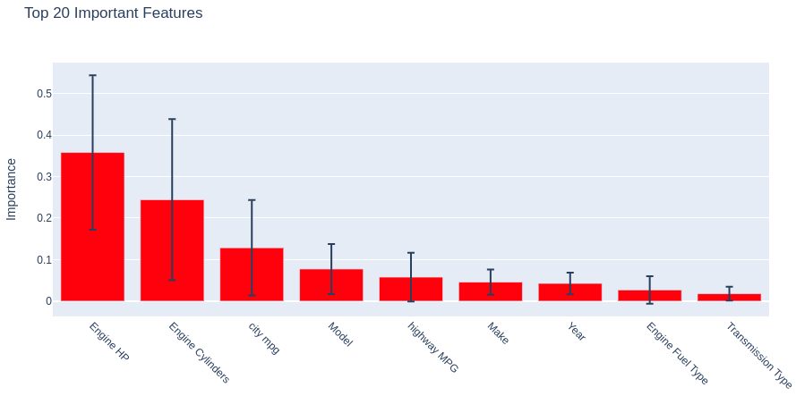
The first three positions:
1) Engine HP;
2) Engine Cylinders;
3) City MPG
are occupied by those very indicators that had high Spearman correlation values.
Determining a sample of potentially interesting cars
Let’s get back to the question of how to identify “underestimated” advertisements and… what does Random Forest have to do with it?
The answer is as follows: essentially, we treat the model as an expert. When the expert’s opinion (prediction) about the price of an advertisement does not align with the actual price (fact), it means that either:
- the price is overestimated (fact is greater than the prediction);
- the price is underestimated (prediction is greater than the fact).
Let’s divide the entire dataset of car advertisements into the categories of underestimated and overestimated prices.
y_diff = y_test-y_pred

df_y_diff = pd.DataFrame(y_diff, columns = ['diff'])
# Divide the column into positive and negative values
# this content is from dsprog.pro
# Dataset of ads with inflated prices:
positive_df = df_y_diff[df_y_diff['diff'] > 0]
# Dataset of ads with reduced prices:
negative_df = df_y_diff[df_y_diff['diff'] < 0]

len_positive_df = len(positive_df)
len_negative_df = len(negative_df)

rate_positive_df = round(len_positive_df / (len_positive_df + len_negative_df),2)
rate_negative_df = round(len_negative_df / (len_positive_df + len_negative_df),2)

print("=========  Number of ads with inflated prices:  ========")
print(len_positive_df)
print("=========  Share of ads with inflated prices:  ========")
print(rate_positive_df)

print("=========  Number of advertisements with underestimated prices:   ========")
print(len_negative_df)
print("=========  Share of advertisements with underestimated prices:   ========")
print(rate_negative_df)
========= Number of ads with inflated prices: ========
355
========= Share of ads with inflated prices: ========
0.44
========= Number of advertisements with underestimated prices: ========
445
========= Share of advertisements with underestimated prices: ========
0.56
Relying on the opinion of an expert (model): the share of advertisements with inflated prices is comparable with the share of advertisements with underestimated prices.
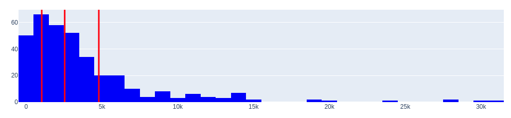
Let’s look at areas of overpriced and underpriced areas using histograms. We will also determine the quantiles of the distributions.
To do this, we will write the corresponding function.
def generate_distribution(positive_df, negative_df):
    # Let's determine the quantile values
    positive_quantiles = positive_df['diff'].quantile([0.25, 0.5, 0.75])
    negative_quantiles = negative_df['diff'].quantile([0.25, 0.5, 0.75])

    # Create a histogram for positive values with quantiles marked:
    fig_positive = go.Figure()
    fig_positive.add_trace(go.Histogram(x=positive_df['diff'], marker=dict(color='blue')))
    for q in positive_quantiles:
        fig_positive.add_vline(x=q, line=dict(color='red', width=3))

    fig_positive.update_layout(title_text='Histogram of positive values <br>(inflated cars)')

    # Create a histogram for negative values with quartile labels
    fig_negative = go.Figure()
    fig_negative.add_trace(go.Histogram(x=negative_df['diff'], marker=dict(color='blue')))
    for q in negative_quantiles:
        fig_negative.add_vline(x=q, line=dict(color='red', width=3))

    fig_negative.update_layout(title_text='Histogram of negative values <br>(underestimated cars)')

    # Display histograms
    fig_positive.show()
    fig_negative.show()
    # Let's return the quantile values, they will be useful to us
    # this content is from dsprog.pro
    return [positive_quantiles, negative_quantiles]
quantiles = generate_distribution(positive_df, negative_df)
print("======  quantiles  ======")
print(quantiles[0])
print(quantiles[1])
price_ask = round(quantiles[0][0.25], 2)
price_bid = round(quantiles[1][0.25], 2)
print("======  Price levels  ======")
print("Price ask: %s: "%price_ask)
print("Price bid: %s: "%price_bid)
Histogram of positive values (overvalued cars)
Histogram of negative values (underestimated cars)
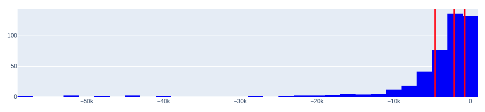
====== quantiles ======
0.25 1030.600595
0.50 2544.584000
0.75 4794.381437
Name: diff, dtype: float64
0.25 -4614.756323
0.50 -2126.003333
0.75 -756.073929
Name: diff, dtype: float64
====== Price levels ======
Price ask: 1030.6:
Price bid: -4614.76:
The histograms of the distributions reveal an important characteristic—they have large “tails”.
Where do these tails come from? They are not very common, but they exist.
- Firstly, such tails can occur when there are significant deviations (outliers) between the expert’s opinion (Random Forest model) and the actual data. It is worth noting that the accuracy of the obtained model averages at 0.886, but it is not 1.0.
- Secondly, the existence of tails can be attributed to luxury (unusual) cars, where the price has a large absolute value.
Overall, the expert’s opinion is reasonably adequate based on the dataset. What can be done about it?
One solution is to apply outlier trimming using quantiles.
In other words, if the expert gives an overly extravagant opinion on the underestimated value, we will consider that the price can be maximally underestimated by the seller by approximately 4 614 dollars.
Thus, we have obtained the answer to the question posed at the beginning!
For the subset of overestimated cars, we will consider that the maximum overestimation can be approximately 4 794 dollars.
What markup can a broker set for resale?
Let’s apply a simple strategy. Let’s consider the advertisements where, according to our expert’s (model’s) opinion, the underestimation of cars is estimated to be between 0 dollars and 4 614 dollars. However, if the goal is specifically resale, transaction costs should be taken into account. Let’s consider a range where the underestimation ranges from 50 dollars to 4 614 dollars.
The size of the underestimation will be the markup for resale, and it will be different for each individual car.
Let’s introduce an additional constraint on the absolute price of the car. We will only consider the advertisements where the absolute value of the price exceeds 5 000 dollars.
Using the obtained model, other strategies can be devised. However, in my opinion, this strategy will facilitate the speed of turnover in resale.
If we sum up the underestimation for all cars present in this range, we can approximately determine the volume of the resale market for the test sample.
Additionally, we can gather data on cars that are overestimated but not significantly. They are likely to be sold soon (these cars will leave the market).
I will reiterate once again. This presentation only shows the tip of the iceberg. There are additional tools to improve the model’s quality. A comprehensive analysis requires additional calculations and accounting for additional nuances. Here is one such nuance. If we carefully compare the quantile values of both datasets (with overestimated and underestimated prices), we can see that they are slightly shifted to the right, approximately in the range of 200 dollars to 400 dollars. Why? It is likely that sellers, in general, are willing to negotiate with buyers and lower the price by a few hundred dollars if the deal is made 😉 Yes, this fact does not bring about drastic changes in the conclusions, but it does exist.
So, let’s write a function that performs data manipulation/slicing.
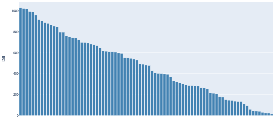
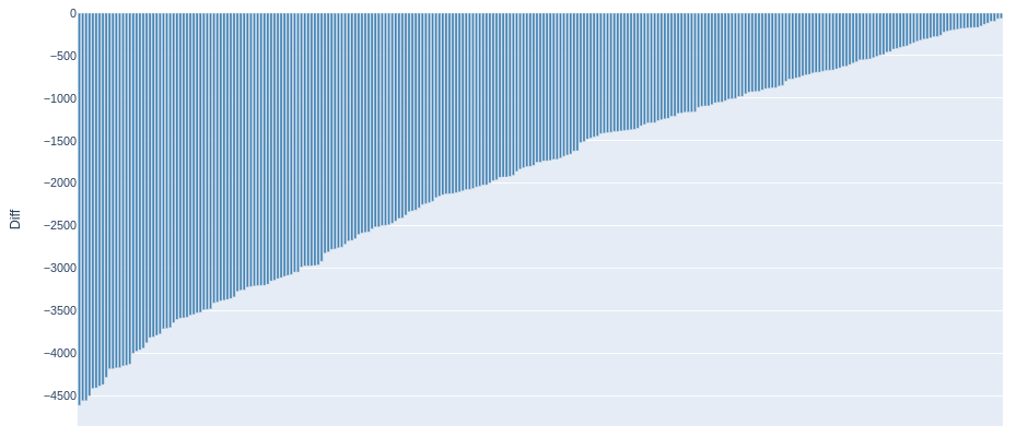
def generate_modelmakelist(direction, y_diff, price_level, transaction_level=50, price_abs=5000):
    if direction == 'high':
        old_indices = np.argsort(y_diff)[::-1]
        head = "Cars that will leave the market within a short period of time"
    else:
        old_indices = np.argsort(y_diff)
        head = "Cars that are interesting from a resale point of view"

    len_old_indices = len(old_indices)
    modelmakelist = []
    for i in range(0, len_old_indices):
        # this content is from dsprog.pro
        if (y_diff[old_indices[i]]!=0):
            if direction == 'high':
                if  (0 <= y_diff[old_indices[i]] <= price_ask) & (price_abs < y_test[old_indices[i]]):
                    modelmakelist.append([X_test['MakeRef'].iloc[old_indices[i]] + " " + X_test['ModelRef'].iloc[old_indices[i]] + " " + str(X['Year'].iloc[old_indices[i]]), round(y_test[old_indices[i]],2),round(y_diff[old_indices[i]],2)])
            else:
                if  (price_bid <= y_diff[old_indices[i]] <=(-transaction_level)) & (price_abs < y_test[old_indices[i]]):
                    modelmakelist.append([X_test['MakeRef'].iloc[old_indices[i]] + " " + X_test['ModelRef'].iloc[old_indices[i]] + " " + str(X['Year'].iloc[old_indices[i]]), round(y_test[old_indices[i]],2),round(y_diff[old_indices[i]],2)])

    df_modelmakelist = pd.DataFrame(modelmakelist, columns=['Make_Model_Year', 'MSRP', 'Diff'])

    x = np.arange(len(df_modelmakelist['Make_Model_Year']))
    fig = go.Figure(data=[go.Bar(
        x=None,
        y=df_modelmakelist['Diff'],
        marker_color='steelblue'
    )])

    fig.update_layout(
        xaxis=dict(
        tickmode='array',
        tickvals=x,
        ticktext=['']*len(x),
        title='Make_Model_Year'
        ),
        title=head,
        width=1100,
        height=600,
        yaxis=dict(title='Diff')
    )

    fig.show()

    return df_modelmakelist
# Let's build a diagram; We will create a list of advertisements for cars that are slightly overpriced; save the list to a file.
df_inflated_prices = generate_modelmakelist('high', y_diff, price_ask)

df_inflated_prices.to_csv('slice_inflated_prices.csv', index=False)

# Let's build a diagram; create a list of car advertisements that are underestimated; save the list to a file.
df_underestimated_prices = generate_modelmakelist('low',  y_diff, price_bid)
df_underestimated_prices.to_csv('slice_underestimated_prices.csv', index=False)

# this content is from dsprog.pro
volume_of_revenue_from_car_resale = float(-round(df_underestimated_prices["Diff"].sum(), 2))
price_of_all_advertisements = float(round(df_underestimated_prices["MSRP"].sum(), 2))
broker_commission_rate = round((volume_of_revenue_from_car_resale / (volume_of_revenue_from_car_resale + price_of_all_advertisements)), 3)

print("=========   Potential revenue volume from reselling underestimated cars for the test sample.  =========")
print(volume_of_revenue_from_car_resale)
print("=========   Total value of all cars that are currently underestimated for the test sample.  =========")
print(price_of_all_advertisements)
print("=========   Broker's revenue share   =========")
print(broker_commission_rate)
Cars that will leave the market within a short period of time
Cars that are interesting from a resale point of view
========= Potential revenue volume from reselling underestimated cars for the test sample. =========
527804.85
========= Total value of all cars that are currently underestimated for the test sample. =========
9627616.0
========= Broker’s revenue share =========
0.052
Conclusions
In this material, we have examined a dataset of car advertisements for the purpose of their resale by a broker.
We have obtained answers to the following questions:
- Brand and model popularity – what is the market situation?
- How can individual “underestimated” advertisements be identified?
- To what extent are they underestimated?
- What markup can a broker set for resale?
- What strategies are possible?
- Is it possible to obtain any data on the resale market volume?
The data has been processed: for the popularity of specific types of cars and for the distribution of prices.
To improve the quality of the Random Forest classification model, elements of correlation analysis (Spearman correlations) were applied. Potentially weak informative indicators were identified and filtered out.
For the application of Random Forest, the original dataset was split into datasets of explanatory and target variables.
A Random Forest model with 500 trees in the ensemble was built.
The obtained model has quite good results. In all five folds, we have scores greater than 0.81.
Without filtering out potentially weak indicators, two out of five folds would have resulted in a score of only about 0.3.
The technique of filtering out potentially weak indicators using Spearman’s correlation was successfully implemented.
The average accuracy of the current model was evaluated at 0.886 out of a possible 1.0.
The indicators/characteristics of cars were sorted based on their influence on the price (MSRP) within the obtained Random Forest model. A diagram was created.
The proportion of advertisements with overestimated prices is comparable to the proportion of advertisements with underestimated prices. Histograms were formed for both datasets. The quantiles of the distributions were determined.
A pattern was observed in the histograms of the differences between the actual prices in the advertisements and the expert judgments (Random Forest model)—they have large “tails”. An explanation was provided for their occurrence.
As an additional measure to increase the effectiveness of the model, the application of outlier trimming using quantiles was proposed. The following recommendations were provided:
- Applying a simple resale strategy based on the obtained Random Forest model.
- Considering acceptable price ranges when using the model as a broker.
A diagram was plotted; a list of car advertisements that are slightly overestimated was generated and saved to a file.
A diagram was plotted; a list of car advertisements that are underestimated was generated and saved to a file.
The approximate revenue volume from reselling cars for the test sample was determined to be 527 804.85 dollars.
This amount is based on the strategy demonstrated here, but it should be noted that there can be different strategies.
The total value of the cars in the test sample was determined to be 9 627 616 dollars.
The test sample constituted 10% of the total dataset of advertisements.
The broker’s revenue share relative to the turnover can amount to 5.2%, which is comparable to the size of banking fees.